Nice greens. Your texturing is decent but I would recommend only use 2-4 shades of green per tree or patch of grass. You can use a different 2-4 shades for a different leafy object, but I've noticed real-life trees and grass have distinct light and dark areas with no need for much in between. https://cookingintongues.files.wordpress.com/2014/02/balestrand-2-2.jpg
22 Art Reviews w/ Response
All 78 Reviews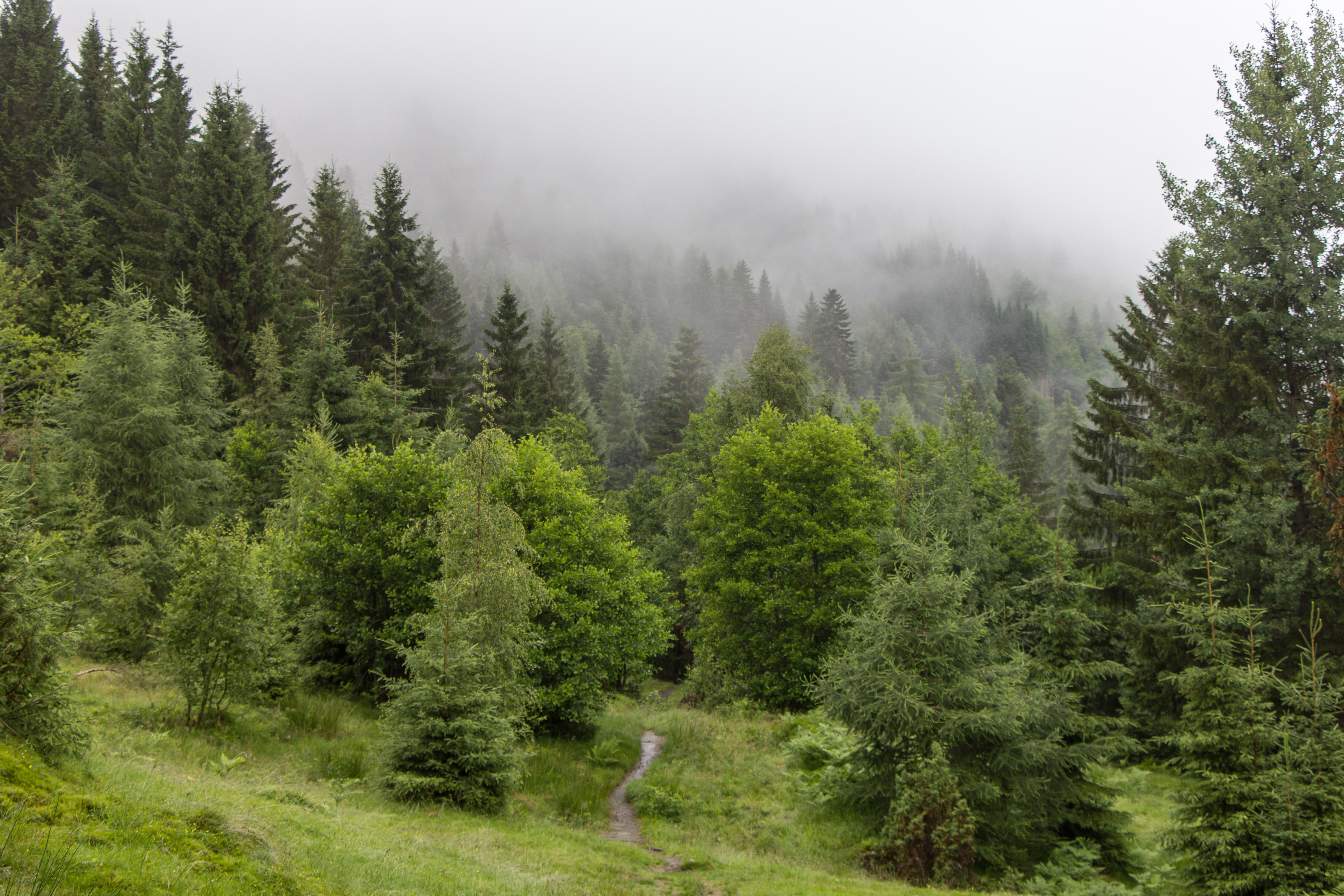
Stinkoman is such a great game with a lot of variety, I go back to it once every couple years.
ScepterDPinoy responds:
Minus stealing powerup weapons from bosses except boss 3.
I think you clicked a checkbox saying to not submit this one to the art portal. You need 4 portal-eligible paintings, so if you edit this and make it art portal eligible then I can scout you (so then you can finally submit stuff to the ACTUAL portal). Let me know
Exirry responds:
Hi, I fixed it. Nice assertive Fluttershy BTW
Fantastic art but at least post the link to the background since it's clearly a photo you didn't take.
C3WhiteRose responds:
Im sorry, I tried to find the author, but i dont remember...
I will try find the author again
"if I can hire any programmer"
Just do it yourself, this type of game is the fastest and easiest possible. Just pick any language, (Flash is easy if you have it) then look up "make a shooter [your language here]" online.
If you have Flash CS3+ I can dump some code on you and you'll be in the fast-lane.
Trying to collaborate with random programmers is a big hassle, as I'm sure you know.
ScepterDPinoy responds:
I was wondering what programs are easier to make games for the internet with. Should I go with Stencyl?
Good pacing and view progression. One thing you may want to avoid is the super thick black borders, which are typically used only for flashbacks e.g. http://mangafox.me/manga/iris_zero/v02/c005/13.html
Kel-chan responds:
thanks for the tip
This re-upload is a definite improvement, hopefully my last words weren't too harsh. However, there are still some inconsistencies (the bottom-left panel is still a bit horizontally squashed, the middle panel's guy face is horizontally squashed (compare it to the top-left panel), the middle guy's lines are much thicker than the top left panel even though they are the same distance from the viewer, and when you enlarge the pic some of the panels are really smooth while others are pixelly. Overall it does the job though and the inconsistencies don't make it harder to read anymore, but just keep them in mind when you work on new pages.
Kel-chan responds:
yeah thanks I'm learning as I go along
Not shabby
I've done some of this "draw some lines inside a polygon stuff" in flash, and overall this is unimpressive. I'd say I could make this in half an hour, or five mins if I had a goal in mind. If you use flash I'd recommend drawing all these lines and stuff, then delete some in a pattern and make a cyclical thought-provoking arrangement, instead of just dragging between points. One super cool thing about flash is the "transform" box (ctrl-t), you can take stuff, set the degrees (divide 360 by 5 to get five rotations, etc) then press the copy button in the bottom right of the window. You can make symmetrical gears (see my second art thing to see what I mean), whirlpools, pinwheels, anything your heart desires. Go forth and be boss.
smirkstudios responds:
You seem to think I was trying to impress you by uploading this image. I'm glad you stopped to take the time to give me what you also seem to think are tips.
I will take a stab at a harder drawing when I've mastered the purely magical aspects of the Flower of Life. I am also familiar with your methods of "gear" making, and I am happy to report that I will make use of your criticism to better my work.
Thanks for your input. Thanks also for the good score! I'm aware this drawing is not hard, that's not why I posted it. Also, just cause you can draw doesn't mean people are going to know that you're helping when you tell them you are not impressed with them. I can tell, but others probably can't/wont.
Yes sir, a job well done
I think the guy below has some wack OCD, his criticism holds no water.
This has some real nice colouring, a balanced mix of soft and hardas well as a professionally restricted colour palette. The lighting is perfect for my standards, it's necessary for the dude to be visible. One fat problem is that the dude has a big head which throw proportions out, making his hands and torso undersized. Unless I'm really comfortable, I put a reference pic right beside my dude. Do that! Also, the less detail (wrinkles) you can get away with in the hands, the better they look. Unless you want old-man hands. As for the dragon, it's kind of a shame the wing tears are so pixely, it'd look much nicer if you smoothed the eraser marks. There, some constructive criticism. Well done.
DmattGibson responds:
Thanks for the review guys. It's nice getting mixed comments. I tried different things in this pic and as a result. This took way longer than it should have. I have things I like such as the fire coming out of the chest and the blue highlights on the dragon and the clothes, and of course things I hate looking at like the wings. Hopefully I can learn a few things from this pic and work on improving my work.
I was bit by a dog once
Male
Beyond the stars
Joined on 7/28/11
- Level:
- 31
- Exp Points:
- 10,542 / 10,670
- Exp Rank:
- 3,467
- Vote Power:
- 7.28 votes
- Rank:
- Police Officer
- Global Rank:
- 19,157
- Blams:
- 51
- Saves:
- 476
- B/P Bonus:
- 10%
- Whistle:
- Normal
- Medals:
- 559
- Supporter:
- 11m 30d